|  WYSIWYG Editing in ScaleRichView WYSIWYG Editing in ScaleRichView | |
Introduction
ScaleRichView is a word processor component designed to produce any sort of printable materials.
It completely implements WYSIWYG technology. The phrase “What You See Is What You Get” describes how the component works.
While editing, you can see documents exactly in the way they will be printed.
ScaleRichView does not require printers to be installed (but it is recommended).
You can add your own components in the scrollbar area making you application more convenient for users, or use special customizable vertical and horizontal toolbars.
ScaleRichView supports more than 120 standard paper formats (ISO (Europe), ANSI (USA), JIS (Japan) and so on) and custom paper sizes.
Tooltips on Scrolling
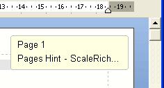
ScaleRichView can (optionally) display a hint window when the user drags the thumb of the vertical scrollbar.
This tooltip displays a page number and a header text, simplifying navigation inside the document.
Ruler
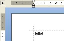
ScrlRVRuler component was created for ScaleRichView editor. It is based on RVRuler component (from RichViewActions) and
was adapted for editing in WYSIWYG mode.
Horizontal and vertical rulers allow users to quickly change margins without invoking dialog windows.
ScrlRVRuler (together with SRichViewEdit) supports 6 measuring units:
inches,
centimeters,
millimeters,
picas,
points,
pixels.
ToolWindow
ScaleRichView package includes a special toolbar component displayed in a popup window.
For example, it can be shown when the user click a button in the bottom right corner of the editor. Such tool window can be used for searching and navigating in the document.

Table Icon
When the mouse pointer is moved above some table, a table icon (handle) appears at the top left corner.
You can define a menu to display when the user clicks this icon. This menu can provide a quick access to table operations.

Layouts
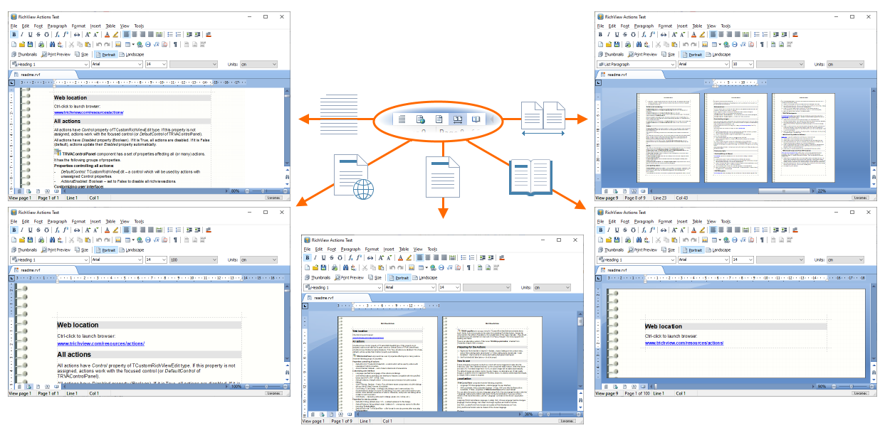
You can define various layouts: “Draft layout” (as one long page), “Web Layout”, “Print Layout” (page-view mode):
- Draft layout shows a document as a single long page.
- In Web layout, a document is shown as it will be displayed in web browsers.
- Print layout shows pages as they will be printed, scrolled vertically.
- Side to side layout is similar to Print layout, but pages are arranged in a single row, are shown completely, and scrolled horizontally.
- Read mode displays pages for convenient reading from the screen.
In addition, you can define your own layouts.
Subdocuments
In addition to the main document, you can edit:
- page headers and footers (including special headers and footers for the first page and odd/even pages);
- footnotes and endnotes;
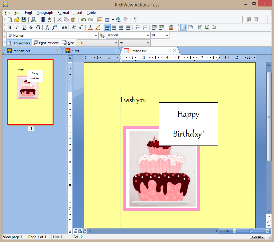
- floating text boxes and sidenotes (numbered notes displayed in text boxes)
All these subdocuments are edited in WYSIWYG mode.
Text box
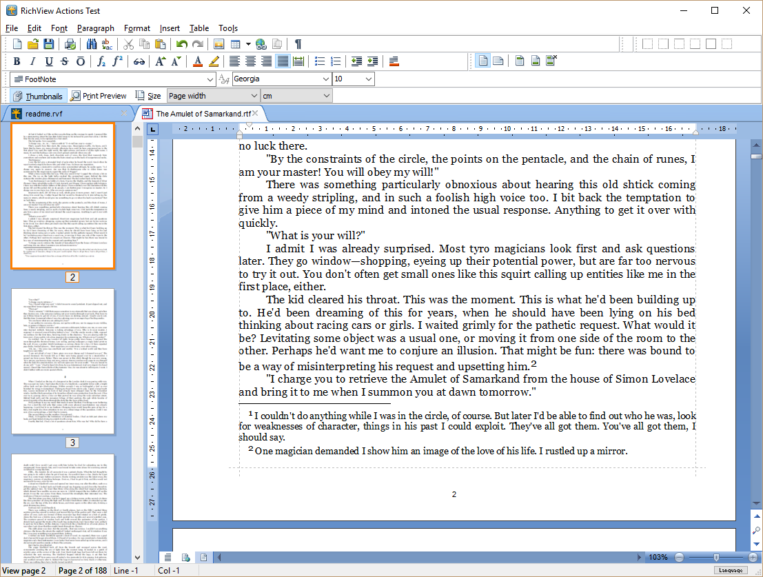
Footnote
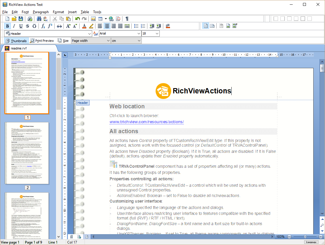
Page header
Line numbers
You can show or hide line numbers. The component allows to customize their appearance.
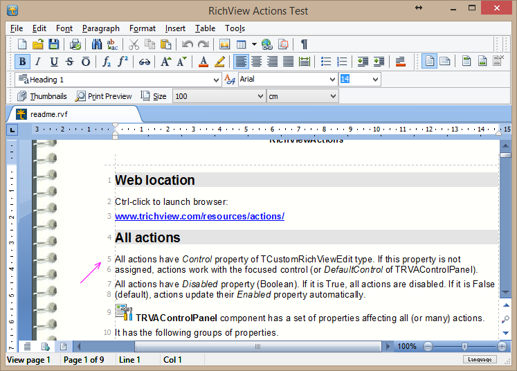
Line numbers
Custom Page Positioning
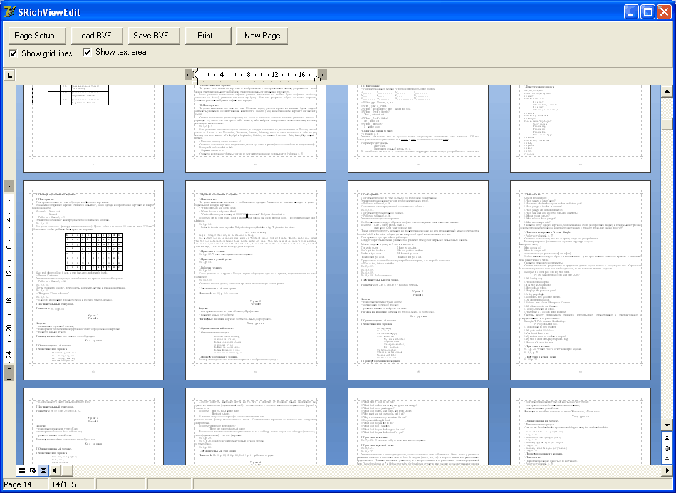
In the standard page positioning mode, pages can be arranged in a single column or in multiple columns.
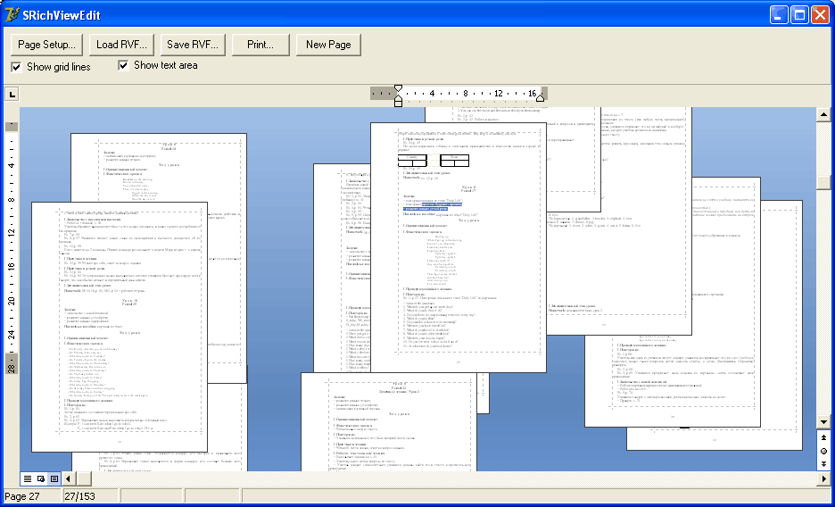
A custom page positioning is a unique feature of ScaleRichView. You can define coordinates of each page.
You can place pages one on top of another in a stack, or arrange them on a circle and rotate. It's up to your imagination!
Z-Order of Pages
In the custom page positioning mode, you can define order in which pages are displayed. If you want to place some page above the others, just specify its number.
You can create groups of pages if you assign the same number to them.
Custom Page Scaling
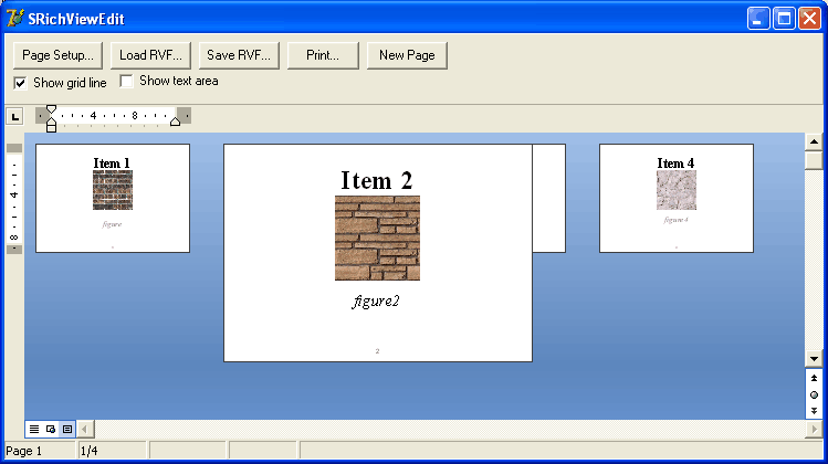
ScaleRichView allows defining scaling value for each page, so you can emphasize the current page or any other page.
Skins in ScaleRichView
TSRVSkinManager
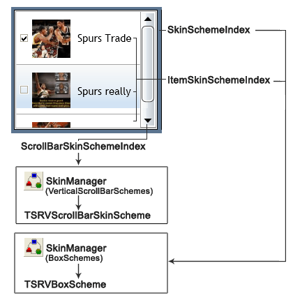
A visual appearance of TSRichViewEdit, TSRVTabSet and SRVControls can be customized using TSRVSkinManager component.
This component contains a collection of skins.
Each skin has sets of colors, bitmaps and fonts as well as rules (schemes) for applying them to controls and their parts.
| 
